

.png)
Building a presentation is a time-limited exercise. I usually find myself rushing to polish up presentation slides before sending them off for review or updating content at the last moment. The last thing I have time for is drawing my own illustrations in a slideshow. This is where working with SmartArt in PowerPoint comes into play.
You may be wondering: What is SmartArt in PowerPoint exactly?
Think of SmartArt as a time-saving graphic tool, built into PowerPoint—which allows you to choose among various ready-made layouts and preset styles to help you visualize your ideas with. SmartArt comes with ready-to-use charts, diagrams, process maps, and more.
In the screenshot below, you can see a simple example of SmartArt, where I’ve added a graphic illustration to show several steps in a process:
How to Use SmartArt in PowerPoint (Quick-Start Video)
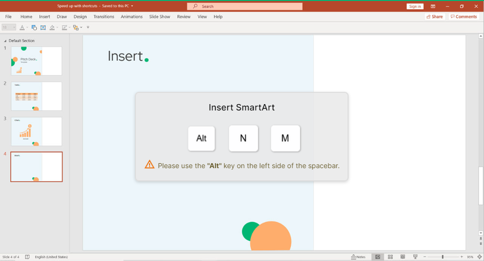
If you want to learn more about working with SmartArt in PowerPoint, check out the quick screencast below. I’ll walk you through examples of how you can use it to improve your presentations. To start off, you can insert a SmartArt object with an easy shortcut Alt N M.
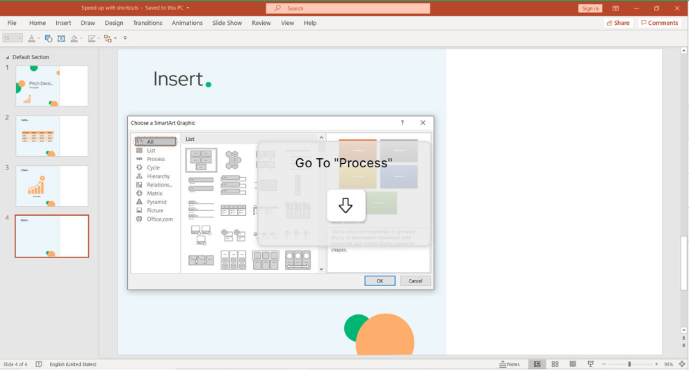
A window will open, where you can choose your favorite structure. Navigate by using the Arrows.
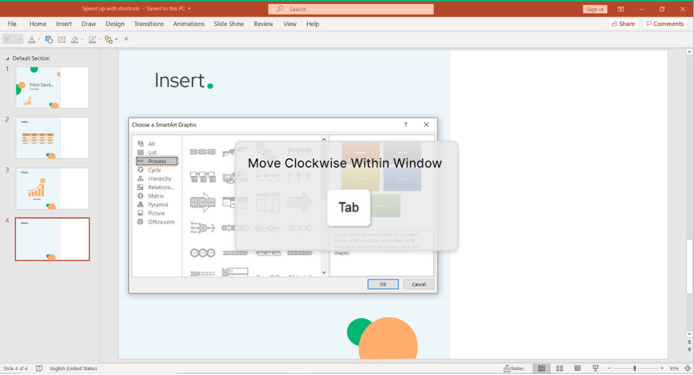
Then, just use Tab to move clockwise within the window and Enter.
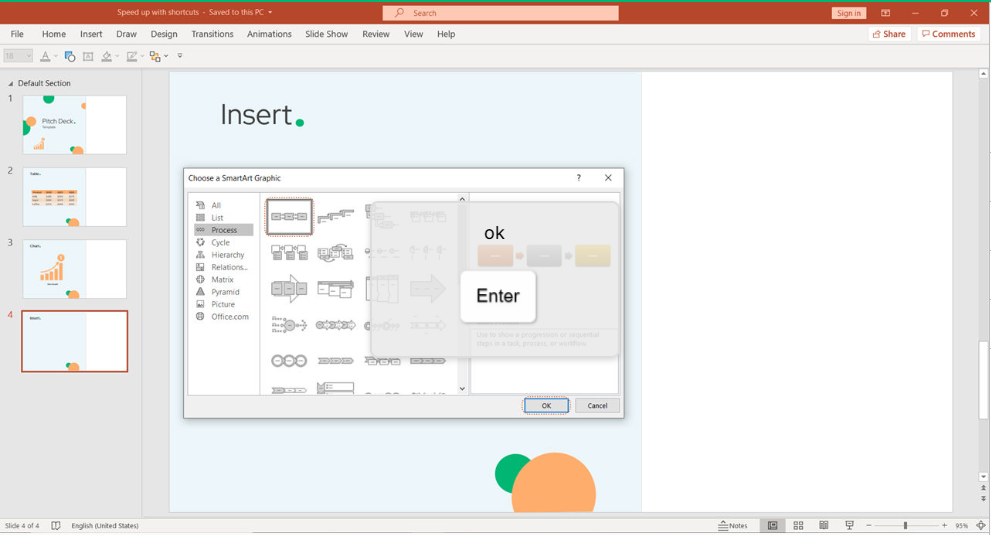
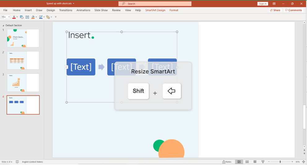
The following design will appear. To resize it, use Shift + Arrow Left.
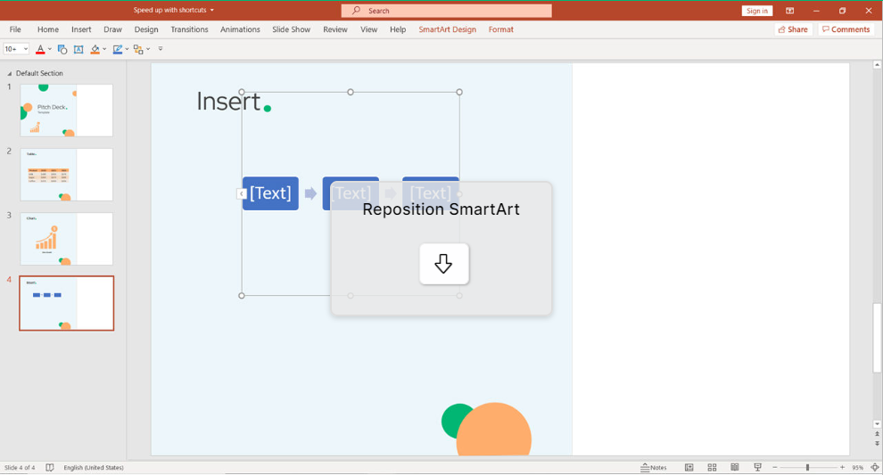
In case you want to reposition, use just the Arrows.
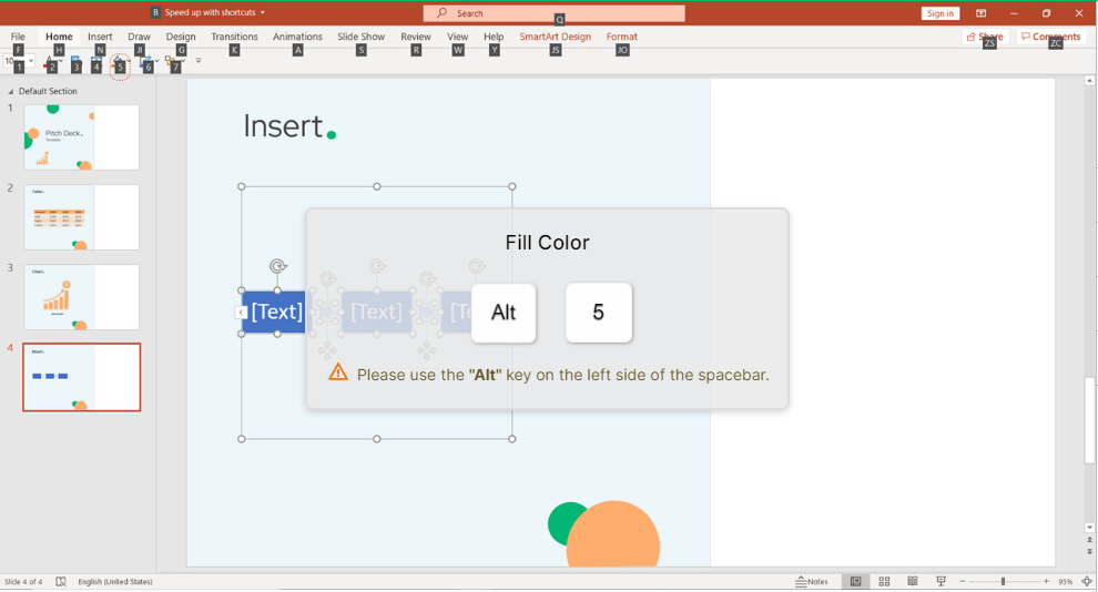
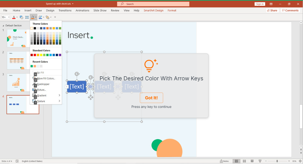
To highlight the SmartArt, use Ctrl + A. Then pick any desired color and click on Enter. As you can see, it changed its color. In that way, you are able to customize your SmartArt based on your company profile.

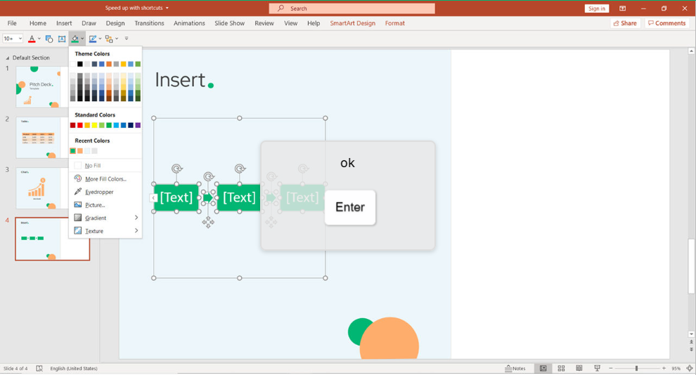
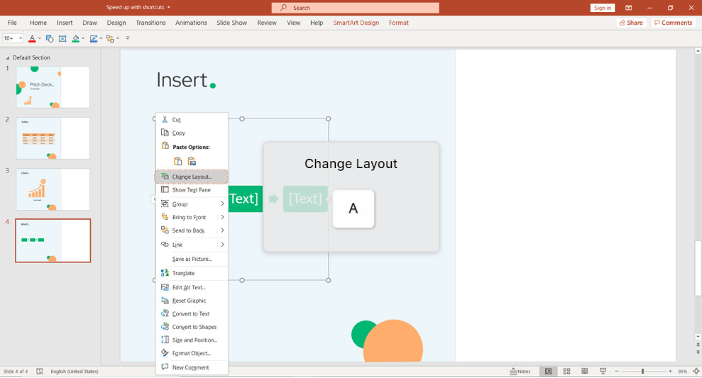
Do Right Click with Shift + F10 for one more trick. By clicking on A you can change the layout of the SmartArt.

8 Important Types of SmartArt (And When It’s Best to Use Them)
As you can see on the SmartArt window, Microsoft PowerPoint has a litany of options for presenting data with SmartArt. With so many options, you might wonder what the right type of SmartArt to use is.
Depending on the type of data that you’re presenting, some types of charts work better than others. Keep in mind though, there are no rules on how to use SmartArt—only suggestions. Let’s look at the important types of SmartArt and the right situations to put them to best use:
1. List
If you have a simple bulleted list of data in PowerPoint, the SmartArt list style is an easy upgrade to make the data more visually appealing.
Lists are pretty versatile. There’s a wide variety of SmartArt styles in PowerPoint, ranging from simple “Basic Blocks” to “Vertical Lists” that show things in a sequenced, descending order. If you aren’t sure what style to use, start with a list style and iterate from there.
2. Process
Process flows are one of my favorite ways to use SmartArt. When I’m working with teams to document how a process should work, SmartArt is a great visual map to capture processes.
The Process SmartArt styles can help you record how things should happen, step by step. If you’re making a product, for example, use a Process to show how the product goes through each step of the manufacturing process.
3. Cycle
Cycles are similar to process maps, but the idea is that they are continuous. Use a Cycle type chart when you’re mapping a process that will keep ongoing.
Cycles are continuous, ongoing processes. If you run a company where processes flow similarly each month, use cycles to capture those processes.
4. Hierarchy
Hierarchies are designed to show how things descend in an organization or process. One natural use for this type of chart is building an organizational chart for a company or group of individuals.
Another use for a hierarchy is to show the individual parts of a larger whole. Imagine using a hierarchy to show the raw materials inside of a finished product.
5. Relationship
A relationship SmartArt is designed to show how individual parts relate. In the examples below, you can see that there are a variety of relationship charts: balance charts, funnels, and hexagons. The common thread is that these charts show how parts relate to one another.
6. Matrix
Matrix charts are similar to relationship charts, but it’s more about taking one object and splitting it into equal parts that make up the whole.
7. Pyramid
Pyramids are kind of like hybrids between process charts and hierarchies. Each of the pyramids is unique and shows how the parts of the pyramid fit together.
8. Picture
The Picture category in PowerPoint SmartArt is a bit of a wildcard; it contains styles from a variety of categories, but makes it easy to add images from your computer.
Make Use of SmartArt in PowerPoint
SmartArt is one of those shortcuts to great-looking presentations in Microsoft PowerPoint. Stop drawing your own custom illustrations and look for opportunities to use SmartArt to craft quick visualizations with instead. It’s a great time-saver that results in good quality graphic results.
Conclusion
Keyboard shortcuts are the easiest way to do things faster. However, with a wide variety of software, it’s hard to remember all the different shortcuts. Even though we all know they are useful, few of us bother using them. keySkillset is happy to provide the best solution on the market to build muscle memory as well as how it is like working with SmartArt in PowerPoint.
.jpg)
.jpg)

.jpg)
.jpg)


.png)

